Streamlining the identity of a popular tech brand
When it comes to design, one of the biggest problems growing organizations face is finding a scalable design strategy that can maintain a consistent visual identity throughout the company’s output – from social media ads to internal presentation decks. In my team’s partnership with Dropbox, we were able to provide a solution to that issue in an efficient and effective manner that resulted in a massive increase in successful projects and a 400% increase in account revenue. Here's how we did it.
R O L E
Art director, designer
Context: A disjointed identity
Dropbox is a technology company that builds simple, powerful products for people and businesses. Since its launch in 2007, it has experienced massive growth in multiple areas: valuation, user base, and number of employees.
With this growth, Dropbox also experienced a large rise in its day-to-day sales and marketing design needs. Unfortunately, due to multiple factors (like tight deadlines, a massive volume of projects, and a siloed organizational structure), the content was frequently being released without a focus on the design, and the visual identity of the company fell to the wayside. Dropbox’s sales and marketing materials looked extremely inconsistent and at times even divergent. Design issues ranged from irregular color applications, to inconsistent graphic elements, to off-brand fonts, to even the incorrect logo being used.
What Dropbox needed was a scalable design strategy.

Before
✶
Before ✶
Identifying the problem points and needs
We collaborated with the Dropbox team to understand their internal structure and process, their typical project pipeline, and their existing brand identity. The problems became clear: Dropbox had a huge amount of sales and marketing collateral to produce but lacked design resources, design supervision, and clarity around its brand guidelines.
We determined the optimal strategy to solve these issues was:
S T E P 1
Clarify the brand guidelines to set standards for overlooked and undefined areas.
S T E P 2
Set up user-friendly templates that could be used across people and departments.
S T E P 3
Refresh Dropbox's graphic style to make it more exciting, dynamic, and flexible.
Clarifying the brand guidelines
After analyzing the existing brand guidelines, we collaborated with the Dropbox team to set standards for the areas that lacked clarity. Our brand clarification initiative covered all areas of the brand, including improvements to logo usage, typography usage, color usage, photography usage, and copy standards. Examples of some new standards we helped Dropbox define include:
Setting Atlas Grotesk as the primary font across all company materials
Setting white and light grey as the primary background colors for company materials
Creating capitalization, punctuation, and formatting standards for copy
Creating font formatting standards for headers, hyperlinks, and more
Setting illustrations as the primary graphic component and minimizing the use of photography
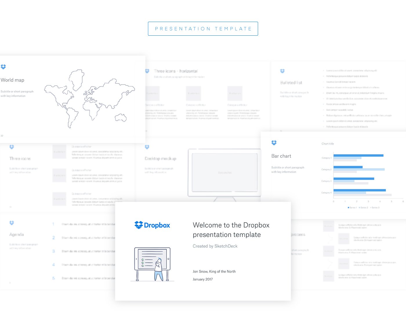
Setting up templates
While Dropbox had a lot of sales and marketing collateral to produce, a good amount of that output fell into similar project types (e.g. presentation deck, e-book, one-pager) or similar content frameworks (e.g. case study, product guide). Consequently, to make the production of that content easily repeatable and visually consistent, we created multiple templates for the Dropbox team.


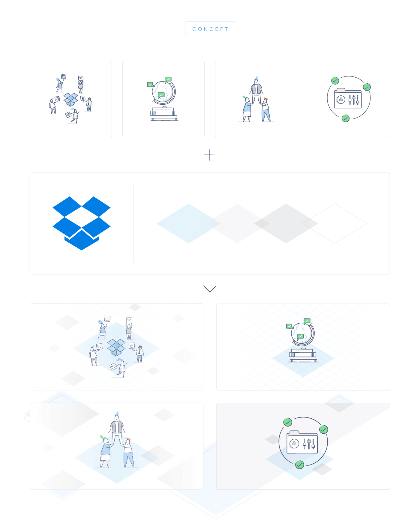
Refreshing Dropbox’s graphic style
While streamlining and unifying Dropbox's visual identity was extremely impactful, we wanted to do more. We wanted to elevate Dropbox's graphic style and give its existing visual identity the opportunity to be more exciting, dynamic, and flexible. Inspired by the rhombus shape in the negative space of the Dropbox logo, we developed new graphic motifs that could be applied as backgrounds or decorative elements. Given the elimination of blue backgrounds from the visual identity, this new graphic treatment would add a bit of excitement to Dropbox's minimal aesthetic.
After seeing the new graphic style, the Dropbox team was delighted. The new graphic style was used across all their sales and marketing collateral until 2017, when Dropbox implemented a major redesign of its brand.